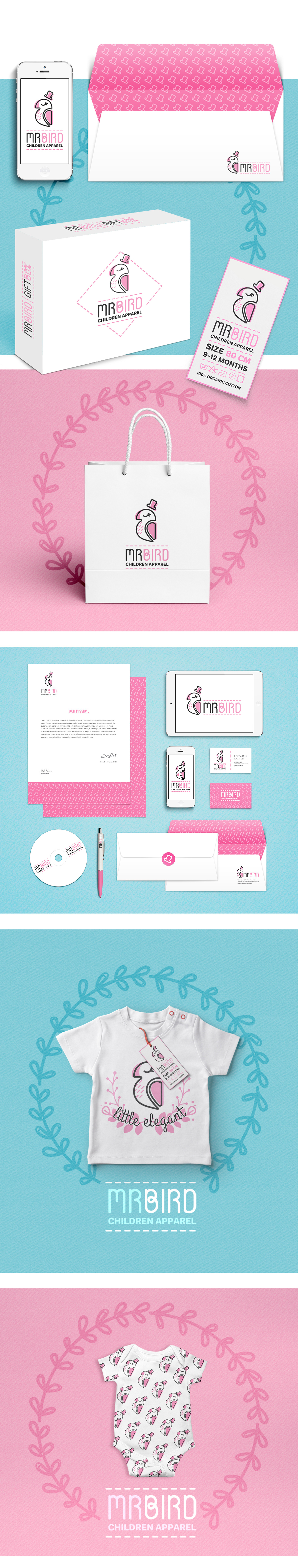
Mr Bird
Children Apparel
Visual Identity | Apparel | Packaging | Labels
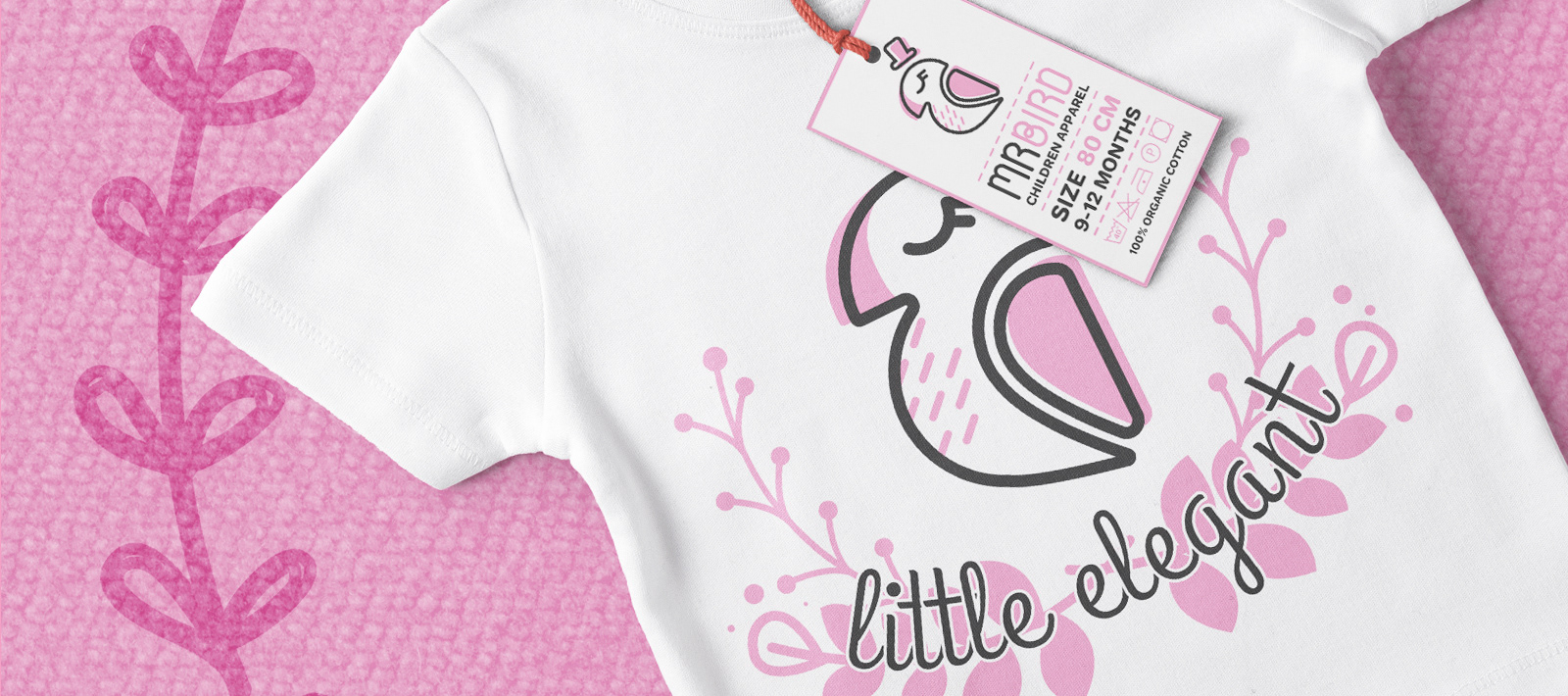
The main goal for this brand project was to combine delicacy, soft colors and child-like motifs while still maintaining slightly geometrized design forms. The logo was supposed to stay connected to design rules (in opposition to a freehand design), while being an illustration in itself.
Clothing prints were designes with use of logo, as the bird plays additional role of the company mascot characer. As it goes for color the client went for soft pink shades – very traditional color for childrens clothing and toys. Logo or its elements (eg. a hat) can be used in the form of duplicated graphics, design, accent or overprint. In addition, gift packaging and handbags for the store have been designed.