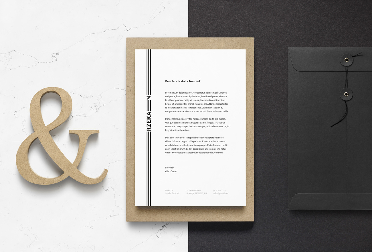
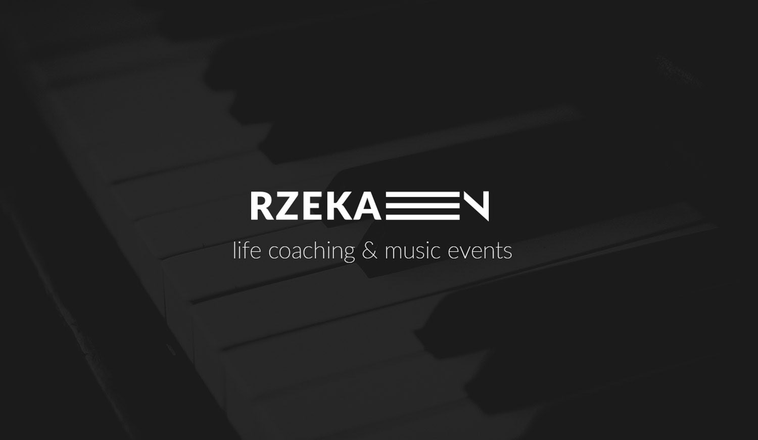
Rzeka En
Life Coaching
Visual Identity | Add-ons
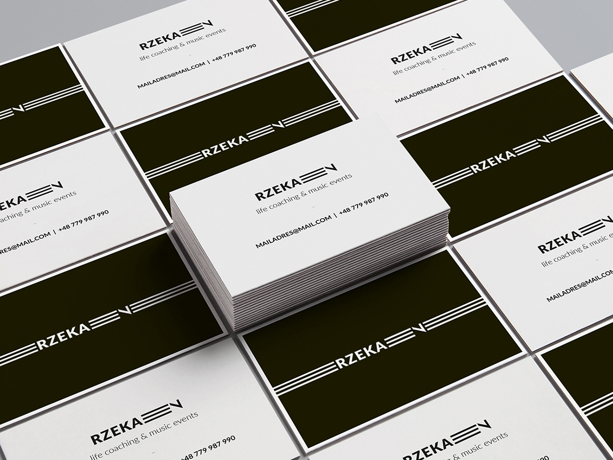
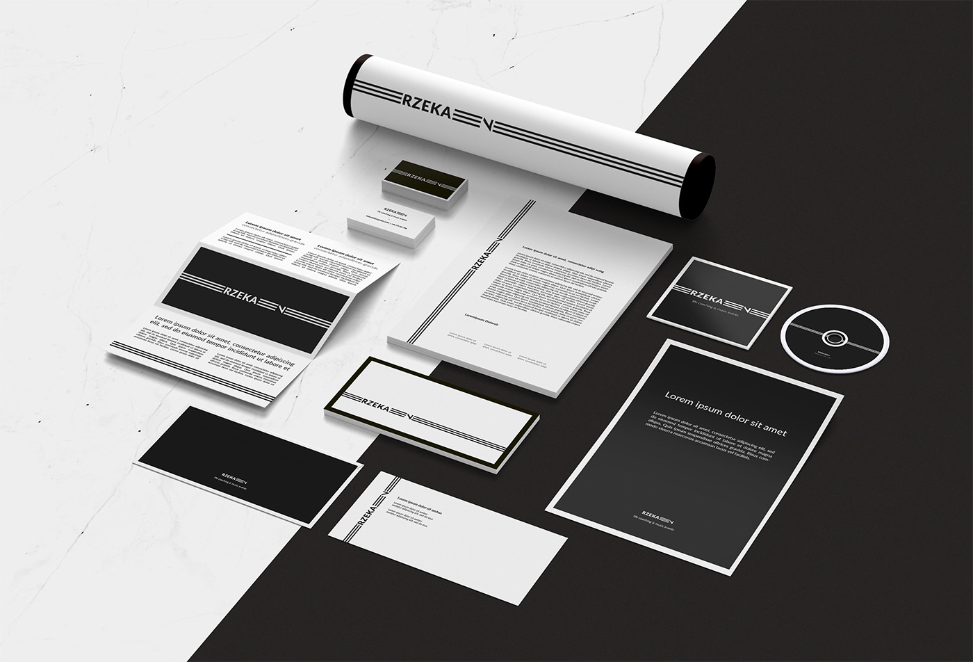
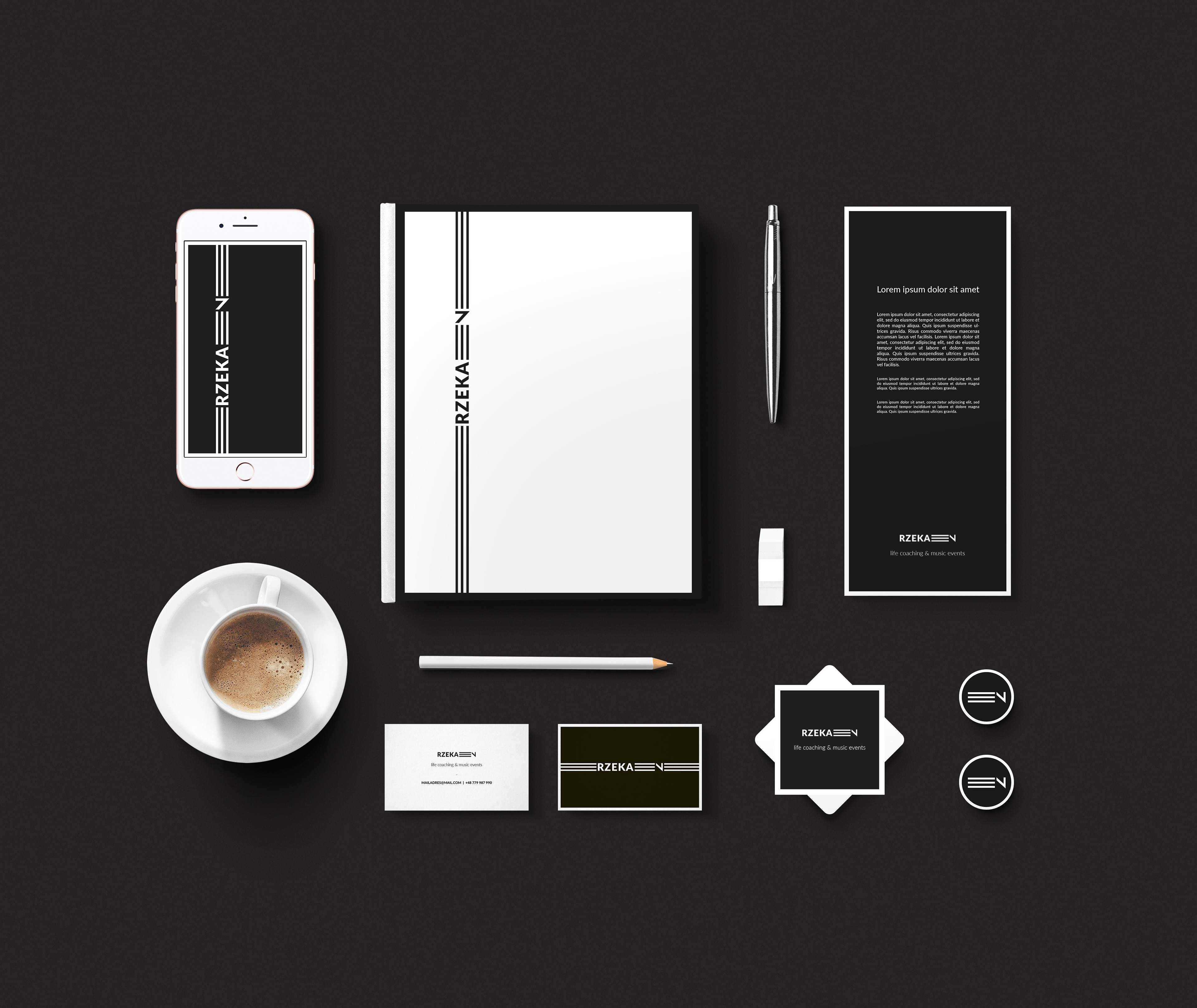
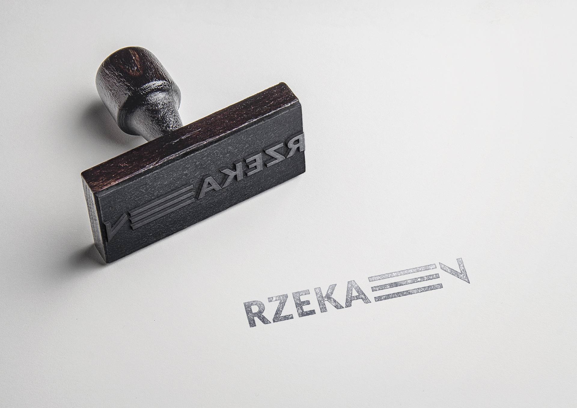
Rzeka En is a life coaching company that deals with philosophical consulting and organizes musical events. Graphic design for this brand focuses on simple forms and minimalism, therefore I decided to go for a typography logo.
Starting point for the project was when I learned the meaning behind the company’s name. EN stands for founders’ initials – Edward and Nathalie. They are a couple whose life and passions spins around the music. While “Rzeka” goes for “River” in english, it is important to explain that in this particular brand case it is a philosophical concept. In Heraklit words – everything flows and you can not enter the same river twice, therefore it was logical to set my mind on the name meaning, adding a bit of musical symbolism. And for that I have chosen the stave which can also be interpreted as lines. Adding the optimal length it makes the logo seems like something is being moved forward inside.